Typefaces for road signs, aircraft panels and railways are always interesting because they place the emphasis almost entirely upon function, leaving style as a very secondary consideration - something that many people seem to forget about typography, balancing the two for any given situation.
In those three situations (and there are others) you need to be able to read quickly, possibly from a distance, in a situation that might be an emergency or possibly become one very quickly. So, fancy letters are not needed if more legible plain letter designs are available.

A victory of style over content. Whilst undoubtedly pretty, Alexei Copperplate isn't necessarily the best typeface to use on a road sign.
Well before the days of the Internet, a way was needed so that any local administration could create its own set of letters, in any required size, in a standard, legible manner, in isolation from such niceties as a set of standard stencils bought from somewhere or other - no doubt, with someone making a pretty pfennig out of it.
So, in steps the idea of a typeface that can be made up using a ruler and a pair of compasses, based upon a standard grid that anybody could make, if they knew the simple formula for each character. With only straight lines and sections of circles to use, it would be relatively easy to make up any character at any size.
This is the DIN 1451 font. The characters in it are multiples (ie, whole numbers and then fractions like 1/2 and 1/4, and that's it) of a base unit. The curves are all the same set of integer diameters so again, 1, 2, 3 and so on.
One result of this is that the normal extension of rounded forms (such as the letter 'o' or the round part of the letter 'd') beyond there neighbouring straight lines (such as the flat end of the vertical line in the letter 'd') is not there. However, in today's world of 'one size fits all' it has been forgotten that the larger the type, the smaller this effect is. So whilst a font at 8pt will have a quite larger 'o', by the time you get up to a road sign with six inch letters, the effect is minimal. This is why printing large type using a font that is meant for small type is wrong - that one-size-fits-all Helvetica that looks okay on a business card is no good on a large sign or in small print.
So, where do we start from with DIN 1451?

This is all there was on the Internet. Even the font at Linotype had been messed around with (looking at the Fette Engschrift 'S' demonstrated that) so that couldn't be trusted.
In the ASCII range, the height from the baseline to the top of the capitals is 7 units and the descenders go down by two more units.
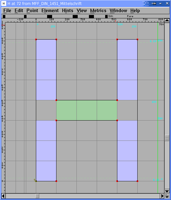
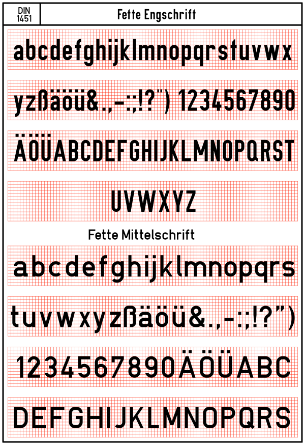
In the Fette Mittelschrift (medium width), the H has a width of 5 and an additional tracking increment of 1 unit for the inter-character spacing. The letter spacing is always one unit.

In the Fette Engschrift (narrow), Many of the capital letters have a width of 3 units and the tracking adds a further one unit before the next letter.
Here, you can see how the curves at the top and bottom of the 'G' are concentric, with diameters of 1 and 3 units and that the curves do not spread over the ends of the letter, below the baseline and the caps height. This means that the letters with curves will tend to look a little smaller at small font sizes but by the time you get up to larger sizes, such as on signs, it will hardly make any difference.

Here, you can see how the curve at the bottom of the 'd' is at the same height as the end of the line. However, as I mentioned above, this is not that important at sign size and in the front of your mind, you should remember that the main idea is that anybody can make up this lettering using a ruler and a pair of compasses - the ability to adjust the vertical position of curves in an artistic way is not a prerequisite.
One other thing to note here is that the outside curves of the 'd' are actually two diameters - one for the side facing away from the stem and one for the side facing the stem. This makes the line narrower where it joins the stem - if it kept the same radius as it went around this part of the curve, it would join the stem a lot further down than it does.
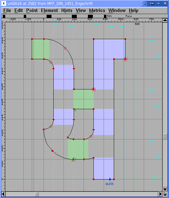
So, onto the Gurmukhi Unicode part of the font. Here, the letters start on the left side at zero, just as the ASCII characters do but the top-line extends to the left by half of the letter-space tracking.
This means that characters drawn on their own appear balanced (the line is not off to one side) and also that the left side of the character proper, aligns properly with any ASCII that you might have on an adjacent line of text.

And, this is what we end up with - Latin ASCII; Extended ASCII; Devangari; Gurmukhi; Odds and Sods; and, Ligatures and Contextual Alternatives.
In the same way that the ASCII 'M' is wider than 3 units in the Fette Engschrift, so is the 'ਢ', and so on.
This is what we end up with for the two fonts for the ASCII/Latin range...
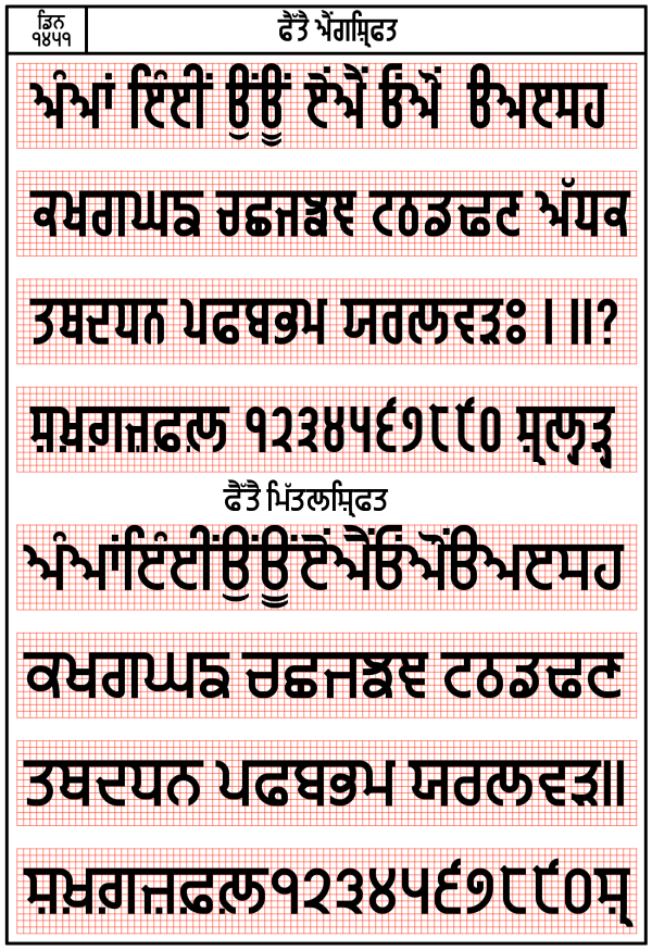
... and this for the Gurmukhi range.

And, this is what it would look like in situ.
You can download these fonts - including a version of each with the Gurmukhi characters mirrored down to the ASCII code range - for free, by clicking here.
Have fun.


